

How to Build a Live India Energy Dashboard
A practical workflow for choosing verified Atlas datasets, preserving chart provenance, arranging a reusable briefing, and sharing it under explicit permissions.
A grid briefing needs an evidence trail #
At 8:45 on a weekday morning, an energy analyst has a short window to brief a trading, operations, or policy team. Demand has moved overnight. Thermal output and renewable generation have changed shape. Frequency may have spent a few blocks away from its usual band. A market price chart may explain part of the story. Each chart must also survive the first sensible question: where did this number come from?
A useful dashboard keeps that answer attached to the visual. The dataset, source, unit, geography, time window, freshness timestamp, and actual, modelled, or forecast status travel with every chart. That evidence trail turns a collection of panels into a reproducible working view.
The India Energy Atlas dashboard workspace now supports that workflow. Public demos open for every visitor. Signed-in users can create dashboards, configure charts from a bounded catalogue of Atlas datasets, arrange the layout, return to saved work, and share it under an explicit permission mode.
This tutorial follows a hypothetical analyst preparing a national grid briefing. The same method works for a state demand review, an exchange-market watch, or a carbon-intensity check.
Step 1: Name the decision before choosing a chart #
Start with one sentence that describes the decision the dashboard should support. Our analyst uses: “Show whether national demand, generation composition, and grid conditions need attention in today’s briefing.”
That sentence creates useful boundaries. It points to an All-India geography, a recent time window, and operational series. It also discourages a panel that looks interesting yet changes no decision.
Open Charts & Dashboards, sign in with Clerk, and choose New Dashboard. Give the dashboard a specific name and a short description. The active Clerk organization is recorded at creation so eligible plans can later select organization sharing. Access remains governed by the chosen sharing mode.
Plan limits are enforced by the server as well as the interface:
Atlas plan | Dashboard limit | Charts per dashboard | Available visibility |
Sandbox or free | 1 | 3 | Public |
Student or institutional | 3 | 9 | Public |
Growth, starter, or pro | 10 | Unlimited | Public or private |
Enterprise | Unlimited | 20 | Public or private |
These limits shape a good first dashboard. Three strong charts can often explain an operating condition more clearly than a crowded wall of weak signals.
Step 2: Build the first chart from an allowlisted dataset #
Choose Add chart from a dashboard, or New Chart from the list page. The configurator exposes five verified data families:
electricity demand for All India or a state;
generation mix by fuel;
All-India grid frequency in 15-minute blocks;
national or state carbon intensity; and
IEX DAM or RTM clearing price and volume.
The catalogue is deliberately finite. Each choice maps to an existing typed Atlas data contract. A browser cannot submit a database table, SQL statement, arbitrary endpoint, or unrestricted filter.
For the briefing, select Electricity demand, Demand, All India, Last 48 hours, and Line. The preview updates before anything is saved. Check the shape of the series and read the provenance strip below it.
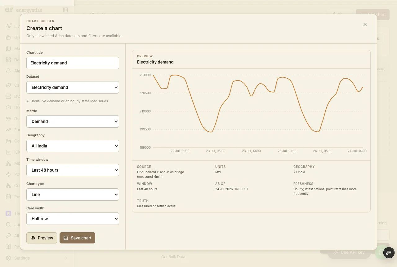
The preview is the point to verify semantics. The demand chart uses megawatts. The live All-India path identifies Grid-India/NPP and the Atlas bridge, with measured or settled actual status and a labelled estimator bridge if one is active. A state selection moves to the state demand contract. The label under the chart records which path supplied the displayed series.
Give the chart a title that explains its role, such as All-India demand — 48 hours. Save it to the selected dashboard.
Step 3: Add context without mixing truth categories #
Demand alone shows the system’s pulse. Generation mix can explain how the system met it, and grid frequency can reveal short operational excursions. Add those as separate charts so each panel preserves its own units and truth label.
For generation mix, choose the fuel series that matter to the decision: thermal, solar, wind, hydro, nuclear, or gas. The source combines CEA, Grid-India, and state SLDC generation feeds through the canonical Atlas production view. Its truth field states whether the served series is metered, modelled, or mixed.
For frequency, the catalogue offers observed 15-minute All-India blocks sourced from ERPC DSM settlement accounts and state-SLDC telemetry through Atlas. A frequency chart uses hertz, has no state selector, and supports windows from one day to 90 days.
Carbon intensity deserves a separate reading convention. The chart is a model-derived estimate from the actual generation mix and the CEA lifecycle factor ledger; forecast rows are excluded. Its unit is grams of carbon-dioxide equivalent per kilowatt-hour. The truth label carries that derivation beside the chart.
IEX panels likewise retain market semantics. Select DAM or RTM, then choose market clearing price in rupees per megawatt-hour or cleared volume in megawatts. The chart identifies the series as a published market result.
This separation matters when a briefing combines measurement, settlement, and modelling. A line can look equally precise in all three cases. The provenance strip keeps their evidentiary roles visible.
Step 4: Arrange the dashboard for the reading sequence #
After saving, the chart appears in the builder with its live data and provenance. Use the move controls to change reading order. Switch a chart between half and full width when the signal needs more horizontal detail. Edit a chart to change its metric, geography, window, visual form, or selected fuel series. Remove a chart when it no longer supports the dashboard’s decision.
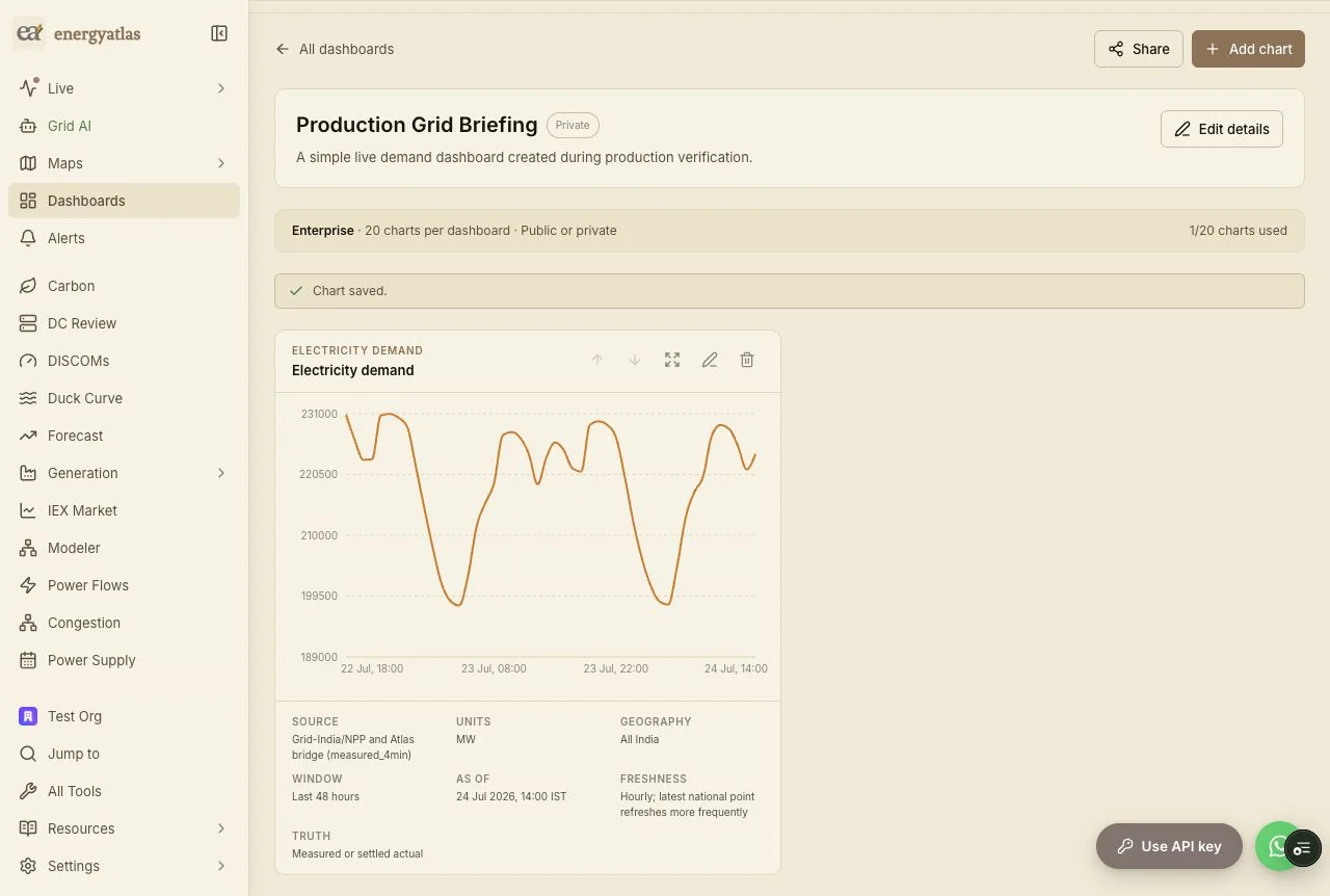
The saved dashboard stores chart configuration and layout. It fetches data from the allowlisted Atlas contract when viewed, so a return visit presents the current eligible series. Empty upstream data produces an explicit empty state. A data-source failure stays local to the chart and offers a retry without discarding the saved configuration.
Return to the dashboard list to confirm persistence. The card shows its visibility and chart count. Open it again, or reload the detail URL directly. The dashboard name, description, chart order, widths, and configurations remain attached to the signed-in owner.
Step 5: Choose the permission mode explicitly #
The owner controls every write. Other viewers receive read-only access under one of four modes available to eligible plans:
Public creates a stable public slug that opens without an account.
Private limits access to the owner and accepted invited viewers.
Organization grants read-only access to a user whose active Clerk organization matches the organization recorded at creation.
View link creates a high-entropy, revocable capability link.
Private invitations also use a high-entropy token. The invitation expires after seven days, can be accepted once by a signed-in Clerk user, and creates a durable read-only collaborator grant. The owner can revoke an unused invitation. The database stores a SHA-256 digest of invitation and view-link tokens, never the raw capability.
Changing a dashboard’s mode revokes any existing view link. API handlers check ownership, organization membership, collaborator status, public scope, or the link capability on every read and write. Hiding a button is only the interface layer; authorization lives on the server.
Use public mode for a chart you intend to cite in a report, send to a broad mailing list, or embed in an open research workflow. Use private, organization, or invitation access for an internal operating view. Use a revocable view link when recipients should open the dashboard without receiving editor rights.
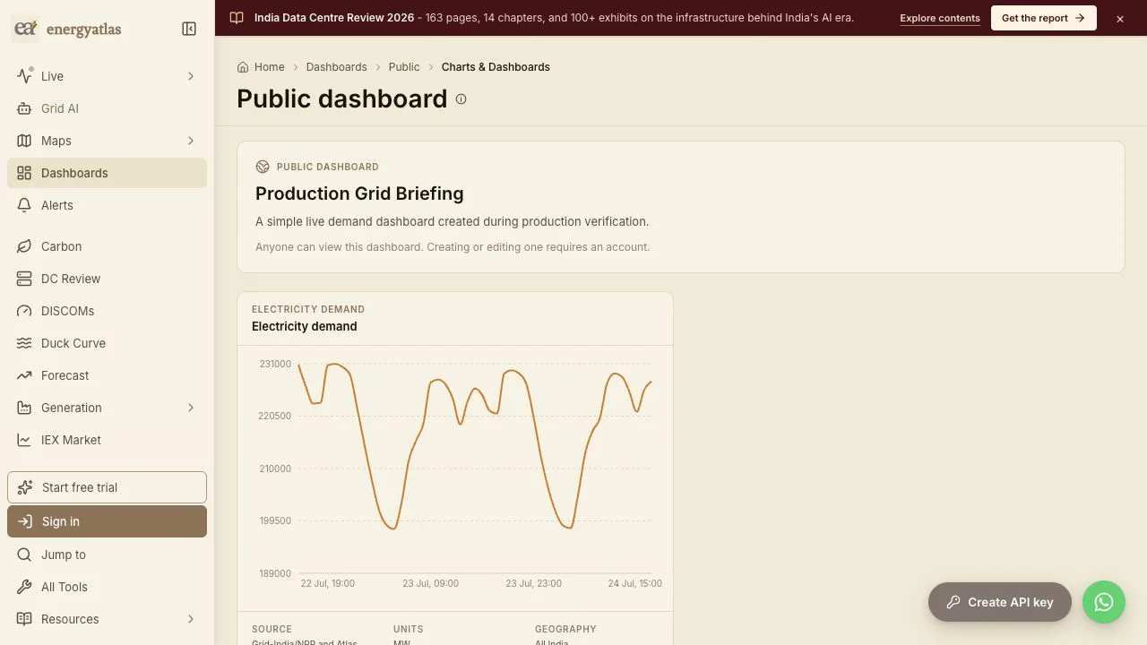
The production example shown here is available as a public demand dashboard. A signed-out visitor sees the chart and its provenance, while creation and editing remain behind authentication.
Step 6: Start from a live public example #
Three seeded dashboards provide working examples with current data contracts:
India Grid Pulse combines demand, generation mix, and frequency.
Clean Power Watch pairs generation composition with carbon-intensity signals.
Power Market Watch places IEX day-ahead price and volume together.
Open a demo and read the provenance under each panel. Then create a smaller version around your own decision. For a state analyst, that may be demand plus carbon intensity for one geography. For a market analyst, it may be DAM price and volume over the same window. For an operations briefing, national demand, generation mix, and frequency form a compact opening page.
Limits and reading discipline #
Dashboard freshness follows the upstream dataset and the cadence printed on each chart. The As of value is the latest point served for that configuration. It should be read together with the freshness description.
Generation data can contain metered, modelled, or mixed series, and the truth field states the served basis. Carbon intensity is a calculation built from the generation mix and an emissions-factor ledger. IEX panels report published market results. Grid frequency uses observed 15-minute blocks. These categories support different claims, even when they share one dashboard.
Saved dashboards preserve configuration and layout; they do not preserve a historical snapshot of every rendered point. Capture or export evidence separately when a memo requires an immutable record for a specific timestamp.
Frequently asked questions #
Do I need an account to view an India Energy Atlas dashboard? #
Anyone can open a dashboard published in Public mode or through a valid revocable view link. Creating, editing, saving, reordering, and changing permissions require a signed-in Clerk account.
Which datasets can I use in a custom chart? #
The first catalogue includes electricity demand, generation mix, All-India grid frequency, carbon intensity, and IEX DAM or RTM clearing price and volume. Each chart uses fixed metrics and filters from a typed Atlas contract.
Does a saved dashboard store a frozen copy of the data? #
It stores the validated chart configuration and layout. The dashboard fetches the eligible source series when viewed, and each chart reports its latest as-of time and freshness.
How do private dashboard invitations work? #
Eligible owners can create a seven-day, single-use invitation. A recipient signs in to accept read-only access. The owner can revoke an unused invitation, and the database stores only a SHA-256 token digest.
Can a shared viewer edit or delete a dashboard? #
No. Organization members, invited collaborators, public visitors, and view-link recipients receive read-only access. Owner checks are enforced by the API for every write.
A practical first dashboard #
For the first working session, create one dashboard and three charts. Put the decision in the description. Use a common geography and a time window that matches the operating question. Read the source, unit, freshness, and truth fields before saving. Arrange the charts in the order a colleague will ask questions. Then choose a permission mode and test the link from a signed-out browser when the dashboard should be public.
That short routine produces a view another analyst can reopen, understand, and challenge. The chart remains visually useful, and its evidence trail stays in the frame.
Sources & method
Product behavior and plan rules were verified against the production India Energy Atlas dashboard workspace on 24 July 2026. Screenshots are production captures from the authenticated builder and signed-out public view. Dataset semantics follow the Atlas allowlisted contracts: Grid-India/NPP and SLDC demand telemetry; CEA, Grid-India, and SLDC generation; ERPC DSM and SLDC frequency blocks; canonical fuel mix with the CEA lifecycle factor ledger for carbon intensity; and published Indian Energy Exchange results. Displayed values refresh with their upstream cadence. Carbon intensity is model-derived, generation truth can be metered, modelled, or mixed as labelled, and saved configurations are live views rather than immutable data snapshots.