
How to read a state's live grid page on India Energy Atlas
A field guide to the demand seam, the fuel-mix personality, interchange, and the carbon convention — read in the order the desk reads them.
A state page on India Energy Atlas is dense on purpose. It puts a control-room's worth of signal — demand, the fuel burning to meet it, what the grid is importing, what the carbon costs — onto a single scrollable surface. That density rewards a reader who knows the order to look in, and quietly misleads one who does not. This is that order: a field guide to reading one of these pages the way the desk that built it reads it, and a note on what four different readers each take away from the same four charts.
We will walk the page top to bottom, pointing at three live examples along the way — Gujarat, Tamil Nadu and Karnataka — because the same chart tells a different story in a coal-heavy state than it does in a wind-and-solar one.
Start at the top: demand, and the word "now" #
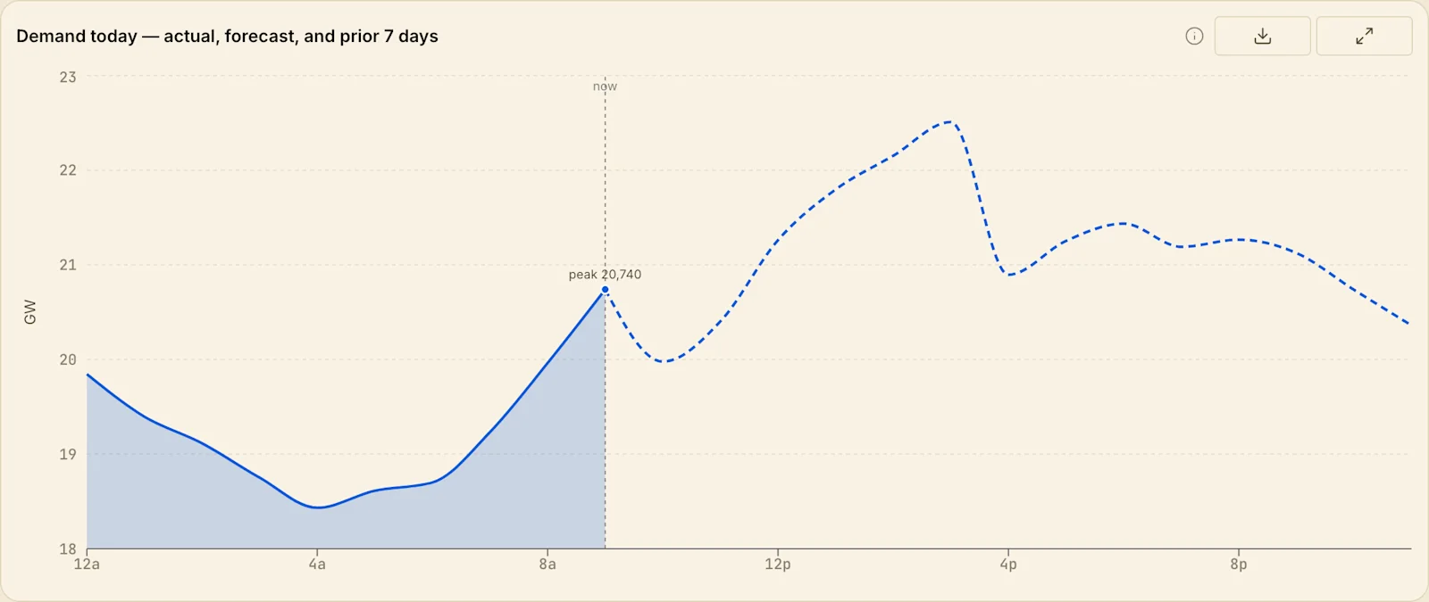
The first number is demand, and the first thing to find on the demand chart is the vertical line marked now. Everything to its left is measured — either a live SLDC feed or, where a state does not publish one, a modelled series we label as modelled. Everything to its right is forecast. The single most common misreading of a grid chart is treating that forecast tail as if it already happened; the page draws a hard visual seam at "now" precisely so you never have to guess which half you are looking at.
Then read demand against its own recent shape, not against a round number. The page carries the last several days, so the question is never "is 20.7 GW high?" but "is this morning tracking above or below the same hour yesterday, and is the evening peak arriving earlier?" Peaks that walk earlier in the day are almost always a cooling-load story — air-conditioning biting sooner as the pre-monsoon heat builds — which is exactly why the demand and temperature panels sit next to each other. A planner who watches the peak move learns more than one who watches it rise.
The fuel-mix chart is the state's personality #
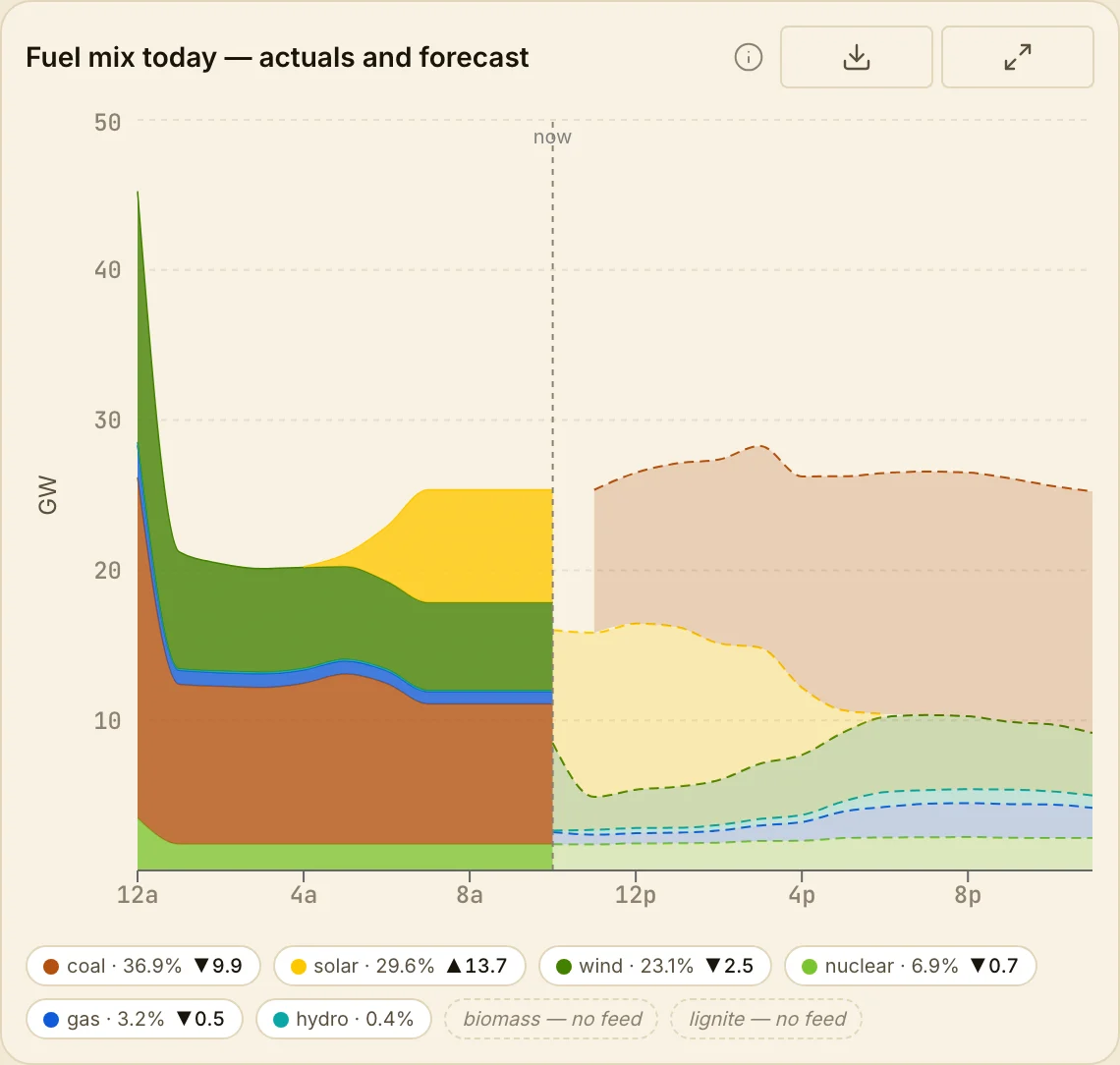
Below demand is the fuel mix — a stacked view of what is actually generating each 15-minute block — and this is where states stop looking alike. In a coal-anchored grid the stack has a thick, near-flat coal band that barely breathes across the day; the only real motion is a thin renewable ribbon at the top. In a renewable-rich grid the middle of the day caves in as solar floods the stack and thermal is pushed down, then thermal climbs back for the evening peak once the sun leaves. That midday cave-in is the duck curve, and on a state page you can watch it form in real time rather than read about it in a slide.
Two reading habits separate the fluent from the fooled. First, the forecast continuation of the mix is drawn as a dashed extension past "now" — same seam rule as demand. Second, when a live feed drops a sample the series holds its last known value forward to the seam rather than diving to zero; a sudden vertical plunge to the baseline is almost always missing data, not a fleet that switched off. Learn to tell a data gap from a real event and you will stop misreading half the anomalies on the page.
Interchange, and the price beside it #
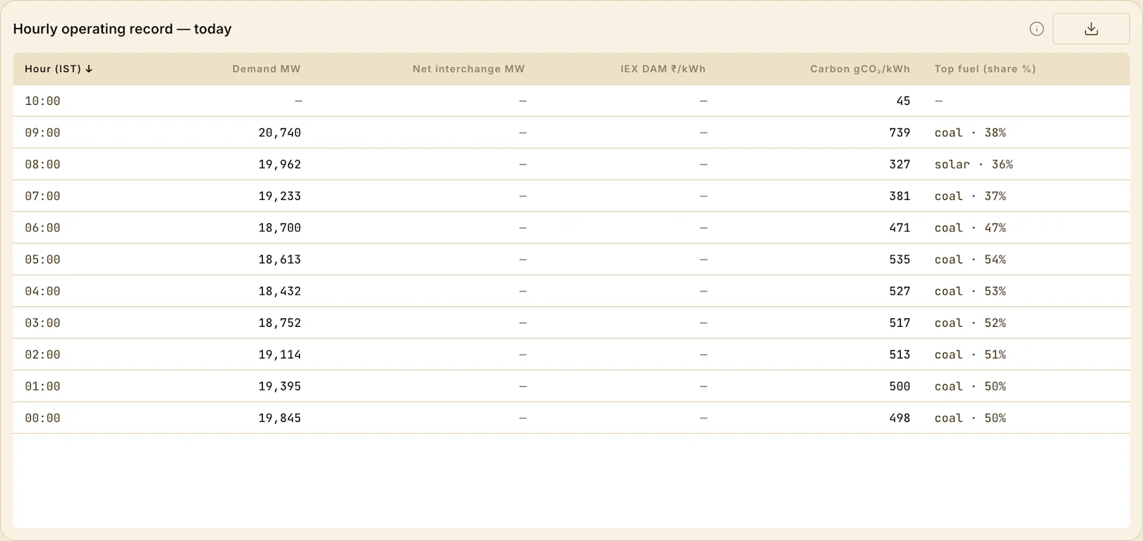
The next thing to internalise is that generation inside a state rarely equals consumption inside it. States import and export power continuously, and the hourly operating record is where that shows up cleanly — demand, net interchange, IEX day-ahead price and carbon laid out side by side, hour by hour. A state can be running its own plants hard and still be a net importer at the evening peak; another can be exporting surplus wind at noon and buying it back after dark.
Read those columns together and the grid starts to make sense as a market, not just a machine. When interchange swings hard, look sideways at price — it is often the same event seen from two angles, which is why the IEX market forecasts page is worth keeping open in the next tab. Scarcity that shows up as an import spike on the state page usually shows up as a price spike on the market page a beat earlier; abundance shows up as an export and a price collapse. The signal is in the co-movement.
Carbon is a computed number, and the convention is stated #
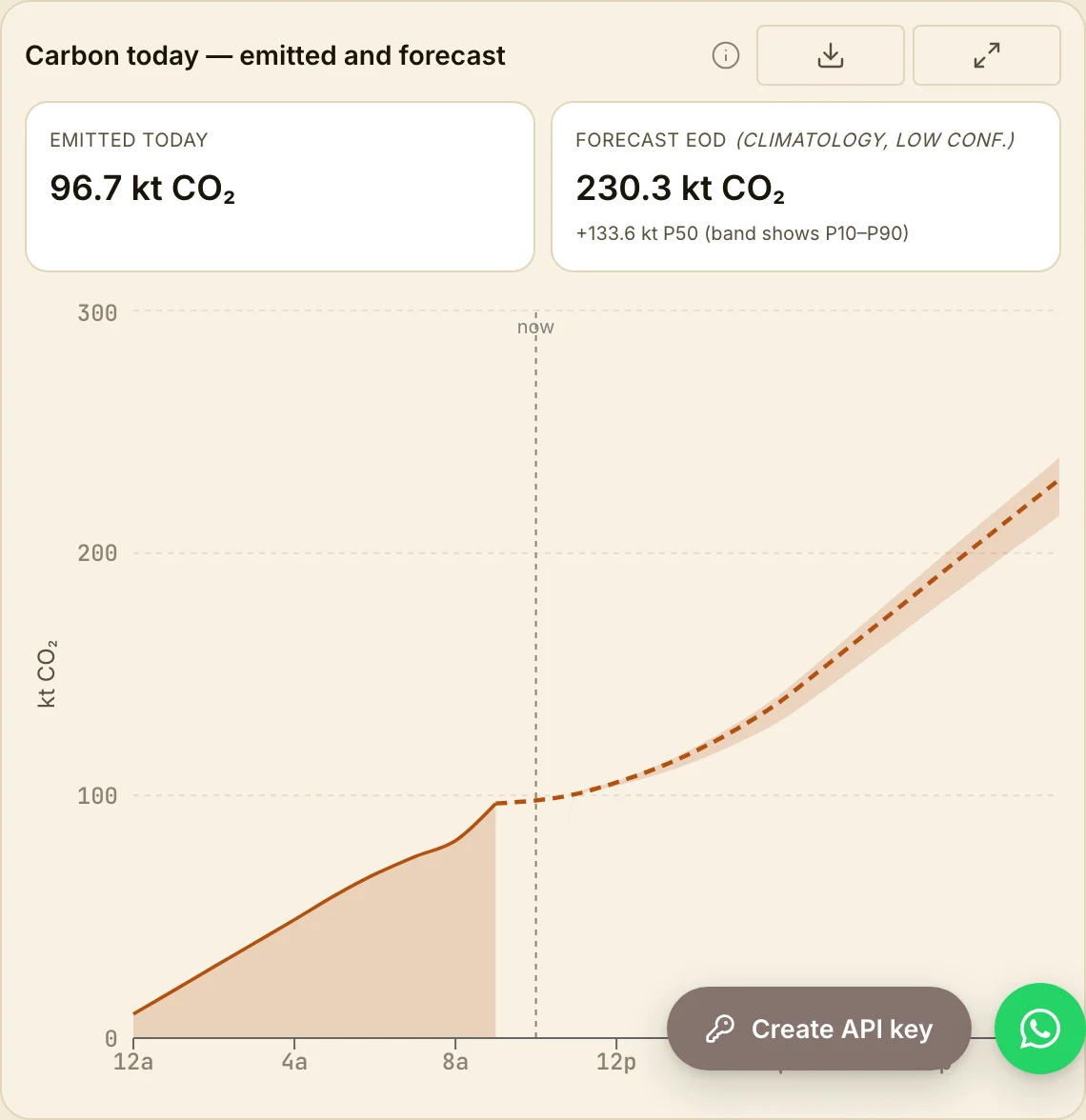
Near the bottom sits carbon, in grams of CO₂ per kilowatt-hour and, separately, as tonnes emitted so far today. The important thing to know before quoting either is that they are derived, not metered — fuel mix multiplied by per-fuel emission factors, under a stated convention. The same grid can be honestly described by two different carbon numbers depending on whether you count on a production or a consumption basis, and whether rooftop solar is netted; and the tonnes-today figure scales with the size of the grid, while the intensity figure does not. The page states which convention it is using so the number is auditable rather than merely impressive.
A carbon figure without its convention is a decoration, not a measurement — and a demand chart read without the "now" line is a forecast mistaken for a fact.
Who reads it this way — and what they're looking for #
The four moves are the same for everyone; what changes is which signal each reader trades on.
The power trader reads demand, interchange and IEX price as one object. The state page is a leading indicator for the market page: a demand curve running above its recent band, a state tipping from exporter to importer, and a thinning reserve are the three tells that precede a price spike. The trader is not admiring the chart; they are timing the next block.
The DISCOM or system planner lives in the fuel-mix and carbon panels. The question is procurement and integration: how much of the evening ramp is still coal, where the duck-curve trough is deep enough to absorb flexible load or storage, and how the modelled-versus-actual gap is behaving in states without a live feed. The decision is what to contract, and when.
The analyst or journalist should read with the convention in hand, always. Most of the bad energy statistics in circulation come from quoting a carbon or a "share of renewables" number without the basis it was computed on. The page's discipline — measured versus forecast, production versus consumption, actual versus modelled — is there so the number you cite survives scrutiny.
The developer reads none of this in a browser: the same demand, fuel-mix, interchange and carbon series are available through the API, so a dashboard, a scheduler or a carbon-aware workload can consume the exact numbers on the page. The chart is the human view of an endpoint.
Read in the right order #
Put it together and a state page reads in four moves. Find "now" and separate measured from forecast. Read demand against its own recent days. Read the fuel mix for the state's personality and its duck-curve dip. Then read interchange and price together to see whether the state is leaning on its neighbours — with carbon last, and only ever with its convention in hand.
Do that on Gujarat and then on Karnataka back to back and the contrast teaches the grid faster than any explainer: two states, the same instruments, two completely different machines. Every number on these pages traces to a primary source — SLDC telemetry, CEA ledgers, IEX snapshots — and where a value is modelled, it says so. That is the whole contract: look in the right order, and the page will not mislead you.
Sources & method
All figures are live India Energy Atlas panels from the Gujarat state page, captured 22 July 2026. Demand, fuel mix and carbon are drawn from SLDC telemetry where a live feed exists and modelled otherwise (labelled on the page). See the carbon-intensity methodology for the emission-factor conventions.