
The price-duration curve: how often India pays peak
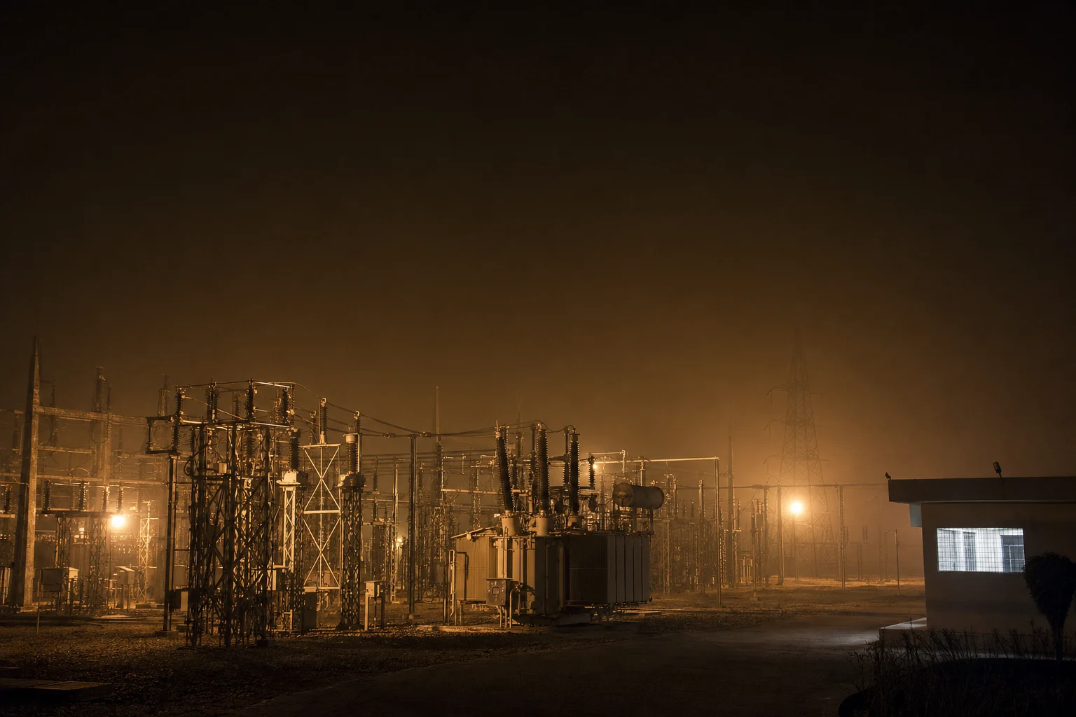
Sorted high to low, a year of India's day-ahead prices sits at its ₹10,000/MWh ceiling for roughly one hour in seven, around a median barely a third as high. The tail is close to vertical, and the annual mean hides the geometry that matters.
Sort every fifteen-minute clearing price of the past year from highest to lowest, plot it against the share of time, and you have the one chart that belongs underneath every power procurement decision made in India. It says the day-ahead market spends roughly one hour in seven pinned to its ₹10,000/MWh administered ceiling, and that the typical block costs barely a third of that. One chart, two facts — and almost no Indian tender, PPA or storage business case is priced off it.
What the curve is, and what it deliberately throws away #
Take every fifteen-minute day-ahead block on the India Energy Atlas market feed over the year to 24 July 2026. Discard the timestamps. Sort the prices from highest to lowest and plot price against the cumulative share of blocks. That is a price-duration curve.
Throwing away the clock is the whole trick. The hourly shape on /duck-curve answers when power is expensive. This curve answers how often, which is the question every capital decision turns on.
Start with two summary statistics, because their disagreement is the story. The median block — the one in the middle, with as much of the year priced above it as below — sits at ₹3,169/MWh, and the mean of the same year stands nearly a third higher (Fig. 1). In a symmetric distribution the two all but coincide; the distance between them measures how much of the average is manufactured by a handful of very expensive blocks.
The decomposition is simple. Blocks at the ceiling occupy about a seventh of the year at exactly one price, so on their own they contribute roughly ₹1,500/MWh to the annual mean (modelled from the observed threshold shares). Better than a third of the average price of Indian day-ahead power comes from a seventh of the year. Strip those blocks out and the rest averages around ₹3,000/MWh (modelled). A tender evaluated at the blended mean carries that slab of ceiling exposure inside a single unnamed number.
The tail is close to vertical, and the tail is where the risk lives #
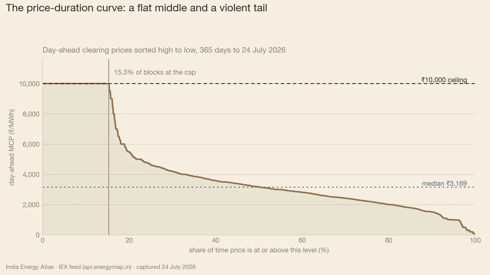
Read the curve down its price thresholds and the geometry gives itself away (Fig. 2). Almost the whole year clears above ₹1 a unit, and a little over half of it above ₹3. Above ₹5 the curve thins out quickly — about a fifth of the year survives that line. Between ₹8 a unit and the ceiling there is essentially nothing: barely a percentage point of the year.
The gaps between those thresholds are the shape, and India's curve has one enormous gap through its middle and almost nothing at the top. Price leaves the ₹5-to-₹8 zone and arrives at the ceiling having spent very little time in between.
So of all the time priced at ₹8 a unit or above, better than nine-tenths is the administered ceiling itself. The market has no upper shoulder: no populated region where high prices still discover their own level.
That geometry is why the average misleads. In the top seventh of blocks price has stopped varying, so quantity becomes the variable that adjusts: which buyer clears, which distribution company covers its evening gap bilaterally, and which feeder waits.
Three readers, one curve #
The same sorted blocks answer three questions, depending on where the reader enters the chart.
The round-the-clock buyer enters in the middle. A distribution utility buying flat across every block pays the mean by construction. Its exposure concentrates in the broad ₹3-to-₹5 band covering about a third of the year (Fig. 2). For demand centres such as Maharashtra and Uttar Pradesh, a hundred rupees per MWh on the median moves the annual bill more than a dramatic week at the cap.
The battery enters at the top. It has no interest in the middle of the curve.
A four-hour battery cycling once a day discharges into a sixth of the clock, and the market prices about a sixth of the year at ₹8 a unit or above. Those two numbers were built for each other.
Take one favourable delivery day in late July. A hundred-megawatt battery with four hours of duration could charge in the midday solar belly and discharge into the evening wall at the ceiling — a spread of roughly ₹8,400/MWh, and about ₹34 lakh of gross energy margin on a single cycle. That is one day from the very top of the curve, gross of round-trip losses, degradation and capital cost; annualising it overstates the case, because the ceiling clears only about a seventh of the year. Solar-heavy states such as Rajasthan and Karnataka offer the deepest troughs to charge into: the charging half of the spread is a locational question, the discharging half a national one.
The peaker enters at its own variable cost. Draw a horizontal line across the curve at a plant's short-run marginal cost and read off the share of the year it is in the money (Fig. 2). A machine with a ₹3/unit variable cost clears for better than half the year. Push the line up to ₹5 and it clears about a fifth. At ₹8 — an expensive liquid-fuel or imported-gas unit — barely a sixth, nearly all of it the ceiling itself. The curve turns a heat rate and a fuel price into a running-hours share in one step, the fastest honest screen in generation planning. The caveat is physical: only plant that can start and ramp into those hours captures them.
Why this piece reports shares of time and never hours per year #
Here is the discipline that makes those shares safe to use. Every duration figure here is a share of observed blocks, and we deliberately decline to convert any of them into absolute hours per year.
The reason sits in the block count. A single national price series at fifteen-minute resolution produces 35,040 blocks in a year. This dataset holds 44,733. The extra blocks are the exchange's thirteen price areas, which price separately whenever transmission binds.
Multiply the ceiling's share by the hours in a year and out comes a tidy hours-at-the-cap number that would be repeated confidently for years while measuring a multi-area block population against a single national clock. Report the share, and let each reader apply it to the hours in their own contract.
The areas agree far more often than they diverge: only 3.4% of block-area observations departed from the national price across the most recent thirty-day window. Divergence, when it arrives, is rare, brief and violent — a handful of late-evening blocks on one congested day. That is why the shares stay a fair read of national conditions even as the block count stays a multi-area superset.
The week is the year, played louder #
A price-duration curve is a distribution, and distributions move. Take the five delivery days to 24 July 2026: the day-ahead curve for that week is the annual curve shifted bodily upward, its mean better than a third higher and its median up about a fifth.
The shift is uneven, and that is the revealing part: the higher up the curve you read, the harder summer moves it. The ceiling's share of blocks runs roughly two-and-a-half times its annual rate, the ₹5-plus share not quite doubles, and the ₹3-plus share gains barely a quarter. Summer inflates the tail and leaves the body of the curve where it was.
The real-time market draws a flatter curve over the same days. Its mean is lower, its ceiling binds around half as often, and its median lands within a rupee of the trailing-year day-ahead median (Fig. 1): the two curves share a centre and disagree entirely about their tails. On the last delivery day of that window, day-ahead cleared roughly ₹1,500/MWh above real time in all ninety-six of the day's blocks — timing optionality was worth about a third of the day-ahead price.
Seasonality moves the same geometry. In every summer month from April to July 2026 the upper-quartile block sat at the ceiling: in high summer the top quarter of hours is scarcity-priced, against something closer to a seventh across the year.
So what — who should act #
For the DISCOM and system planner. Stop evaluating tenders against an annual average. Rebuild them on the price-duration curve of your own delivery obligation, and separate two questions: what the middle of the curve costs you every year, and what the top of it costs when it binds. A portfolio comfortable at the annual mean can be ruinous if its unhedged share concentrates in the capped blocks. The live curve sits on /iex-market.
For the IPP and storage developer. Build the case on the tail's width. The spread available on a good July day is drawn from the sixth of the year priced at ₹8 a unit or above. Four hours of duration is well matched to a tail that wide, and every additional hour reaches into cheaper blocks. Model the charging leg locationally — Gujarat and Rajasthan clear the deepest midday troughs — and the discharging leg against the national curve.
For the regulator. The curve's near-vertical top is a regulatory artefact. When better than nine-tenths of the time priced above ₹8 a unit is the cap itself, the market produces almost no information about what evening energy is worth. A ceiling that binds a seventh of a normal year, and better than a third of a hot summer week, is a routine feature of price formation, well outside the emergencies caps were designed for. Publishing the unconstrained shadow price alongside the cleared price would restore the missing signal without changing what consumers pay.
For the trader and analyst. Track the whole curve weekly. The count of capped blocks and the ₹5-plus share move weeks before monthly means do, and the gap between the day-ahead and real-time tails is the cleanest read available on timing optionality. Our forward-looking work sits at /iex-market-forecasts.
India's power market is cheap for most of the year and administered for a seventh of it. Every serious decision — a tender, a battery, a peaker, a hedge — is a bet on which part of that curve you are standing on. Look at the curve first.
Sources & method
All prices are IEX market clearing prices (MCP) in ₹/MWh read from the India Energy Atlas market feed (api.energymap.in — day-ahead, real-time, price-duration, area-price, forward-curve and storage-arbitrage views), captured 24 July 2026. The price-duration statistics cover 44,733 fifteen-minute blocks over the trailing 365 days; the weekly day-ahead and real-time statistics cover 400 blocks each across the 20–24 July 2026 delivery days; the day-ahead-versus-real-time comparison covers the 96 blocks of the 23–24 July 2026 delivery day; area-price divergence covers the 30 days to 22 July 2026. Conventions: ₹1,000/MWh = ₹1/kWh = ₹1 per unit, and ₹10,000/MWh is the administered ceiling; feed timestamps are UTC and converted to IST (UTC+5:30). Method caveat: every duration figure is a share of observed blocks and is deliberately not converted into absolute hours per year, because the 44,733-block set is a multi-area superset spanning thirteen price areas, where a single national series at fifteen-minute resolution would hold 35,040 blocks; applying a share to an 8,760-hour year would misstate what was measured. Values described as modelled — the ₹1,520/MWh ceiling contribution to the annual mean and the ₹3,044/MWh ex-ceiling average — are arithmetic on the published threshold shares and assume every at-or-above-₹10/unit block cleared at exactly the ₹10,000 cap. Storage-arbitrage figures are a single-day gross energy margin before round-trip losses, degradation, charges and capital cost, and are not an annualised return.